segunda-feira, 1 de maio de 2017
set your beauty
Today marks one year since the development of this package. In a simulation of four days, having for each day a different theme, the layoute and all visual identity of the packaging were developed, accompanied with the planning of the package containing knife design with marks and preparation for printing in grnade scale. The task required a special knife package and a cradle for the product, the idea was to bring a differential packaging and that could be reused by highlighting and enhancing the brand. All visual identity, knife designs and prototype were developed in the period of 5: 30h of proof. It is an immense pleasure to have developed this kind of knife, thanks to all those responsible for it.
segunda-feira, 5 de outubro de 2015
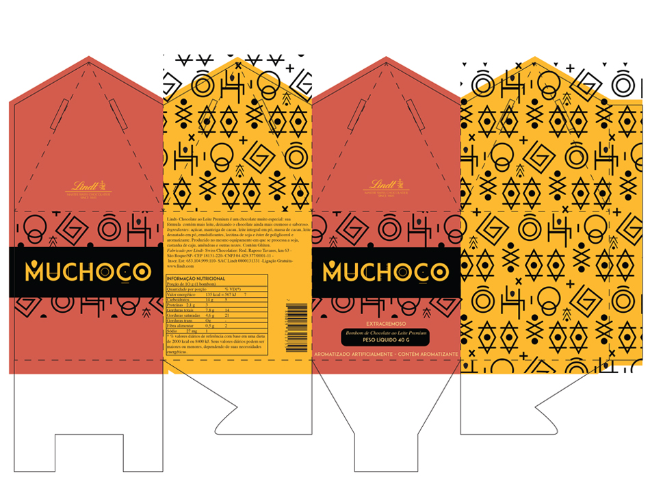
muchoco
(brand developed for packaging)
The task was to create logo and packaging of chocolate in Which the main theme was the Aztec tribe.
The event had the stipulated team six hours and was held at the 5-hour period.
(knife and art of packing)
PS. I also developed patterned packing.
To the next.
discover
(first creation last year with back and front)
Folder DiscoverBh on a tour guide has Also Been held last year and my performance was slightly better, in my perception. This task was a period of 6 hours and was held at 5 hour period.
(folder held, back and front)
To the next
sexta-feira, 2 de outubro de 2015
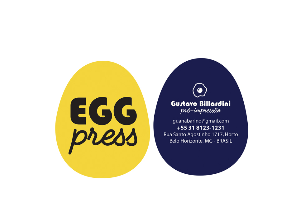
egg press
The task was to make identity and signage for a graphic called 'egg press', his concept was graphic and relationship.
This task has already Been made last year and I can say que my current performance was much better.
Spent 6 hours and 30 minutes to make all identity, business card and signaling, wherein the stipulated team was only 6 hours.
(business card with special knife)
To the next.
terça-feira, 22 de setembro de 2015
cão viver
The task was to create a mood board of an NGO that takes dogs and cats from the street and forward for adoption.
I started researching, and at first everything right. It's amazing where the internet can lead and how it can distort, so the interpretation is the basis of every project.
Did not understand the concept of my work and soon, I was lost in the images who Referred me to another point of view, this view was not right, not for this project.
All things follow the concept. Find it and apply.
All things follow the concept. Find it and apply.
I Began to think on the positive side but not anything positive in homeless dogs, that's sad, the NGO hosting the animal, welcome, that was the point. I identified the problem, Then just needed to think of a solution.
At first I imagined the flattened logo and square in shape, three dogs forming the square on top of a thick and rigid printing, However, the square does not receive anything, needed to move, so the idea Became the heart, want more welcoming to heart? Kkk
Applying figure and ground will have three figures: the dog, the person and the heart, three in a single embrace.
Applying figure and ground will have three figures: the dog, the person and the heart, three in a single embrace.
(do not judge me, this is just the base of the base)
Day 2 - Base
The best way to succeed is doing and how best to of is wrong.
Today's lesson was grid. It's funny how show you things and you apply, but is superficially, it must understand the whole process and form. My soon had a grid base, but the image itself was loose, you looked at the design and spent his direct gaze, turning the dog to the left I do with the look remains for a while inside the image.
In addition to needing a base to fit the image, one needs a grid to maintain the look and attention.
One shouldnt think and study the image and form.
(base)
POPA - (small observations out there)
The contrast / color laws apply in all areas. Noting the sale of flow I Realized that the best selling pieces Were better exposure on the clothesline. The ideal is to present the idea of thirds, so That We use three primary colors of Which two talk to each other (or analogous good combination) and the other will be a contrasting color.
Day 3 - Shape
The idea needs to be Addressed in every way That You Can and Can not, just so you will know what Improve it and technique used was adapts it more to the project.
Always leave uniform to maintain identity.
Work completion -
I started the project on 10 September and end on 21 September, with the weekends and a free Friday.
It was not how I imagined in my head, I need to improve my drawing technique and illustrator, think about prioritizing and think about identity.
I like very simple things, I must be careful about that because it can compromise my work to the poor, the very first of all is complex and worked, I need to study more my means and Applies Them quickly and accurately.
PS I do not know where is the accents.
To the next.
Assinar:
Comentários (Atom)


